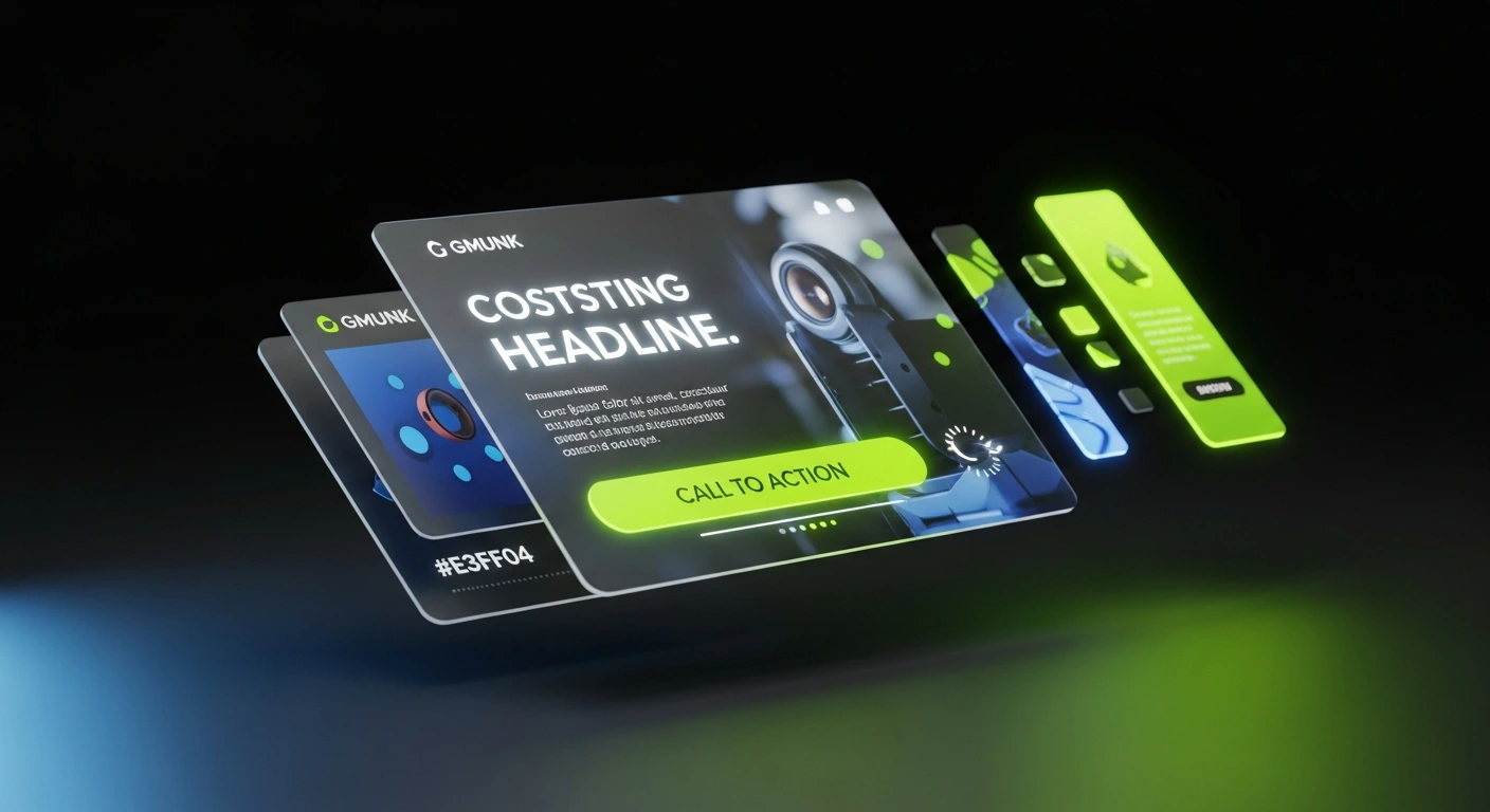
In a world of endless scrolling, a generic ad is an invisible ad. Great ad design doesn’t just blend in—it grabs attention, sparks curiosity, and compels users to click in a matter of seconds. At Pixel Hatch Studio, we specialize in designing high-performance ads for platforms like Google, Facebook, and Instagram that are built to convert.
Effective ad design is a science, blending visual appeal with marketing psychology. From the power of contrast to the urgency of a great call-to-action, every element has a job to do. Here’s our expert guide to designing eye-catching ads that don't just get seen—they get results.
- The 0.8-Second Rule: Winning ads win or lose attention before the viewer's thumb scrolls past.
- High-Contrast Color Blocking: Uses bold neon-on-dark contrast to disrupt monotonous feed content.
- Singular Focus Architecture: Eliminates cluttered messaging in favor of one irresistible value proposition.
1. Contrast: The Secret to Standing Out
In a crowded feed, high contrast is your best friend. It’s the visual difference between elements that makes your ad pop and improves readability instantly. This can be achieved through color (a bright button on a dark background) or size (a large, bold headline).
- Color Contrast: Pair complementary colors to make elements stand out. A vibrant CTA button is the most common and effective use of this principle.
- Minimal Text: Focus on one powerful headline and a brief offer. Too much text creates clutter and will be ignored.
- Use Negative Space: "White space" (the empty area around your design elements) is crucial. It gives your message room to breathe and directs focus to what matters most.
“Creativity is intelligence having fun.”
2. Call-to-Action (CTA) Design: Driving the Click
The Call-to-Action is the single most important part of your ad. Its only job is to get the user to take the desired action. The design of your CTA button can have a massive impact on your ad's conversion rate.
- Make it Obvious: The CTA should look like a button. Use a contrasting color, a defined shape, and a subtle shadow to make it stand out.
- Use Action-Oriented Text: The text should be a command that tells the user exactly what will happen next. Use strong verbs like "Get," "Shop," "Learn," or "Download."
- Ensure Tappability: On mobile, the button must be large enough to be easily tapped with a thumb without frustration.
3. Leverage Color Psychology to Evoke Emotion
Color is a powerful psychological tool in advertising. Different colors can evoke specific emotions and influence decision-making. Using a color palette that aligns with your brand and the goal of your ad is crucial for connecting with your audience.
- Blue for Trust: Ideal for tech, finance, or B2B services where building trust and credibility is key.
- Red/Orange for Urgency: Excellent for limited-time offers, sales, and food-related ads to create excitement and a sense of urgency.
- Green for Growth/Health: Perfect for health, wellness, and environmental brands.
- Black for Luxury: Conveys a sense of elegance, sophistication, and premium quality for high-end products.
High-Performance Ad Creative Benchmark Matrix
Ad Creative Data| Ad Creative Format | Optimal Hook Duration | Core Visual Formula | Expected Benchmark CTR |
|---|---|---|---|
| Kinetic Short-Form UGC | 0.5 - 1.2 seconds | Fast pattern interrupt + dynamic subtitle tracking | 2.8% - 4.5% CTR |
| Bento-Grid Product Motion | 1.0 - 2.0 seconds | Sleek 3D rotation + neon spec callouts | 2.2% - 3.8% CTR |
| Static High-Contrast Carousel | Immediate visual anchor | Obsidian backdrop + lime headline + bold typography | 1.8% - 3.0% CTR |
4. A Single, Clear Message is All You Need
The most common mistake in ad design is trying to communicate too much information. An ad is not a brochure. You have about three seconds to capture someone's attention. The most effective ads have one clear focal point, one compelling headline, and one unmissable call-to-action. By focusing on a single, powerful message, you make it easy for the user to understand your offer and take the next step.