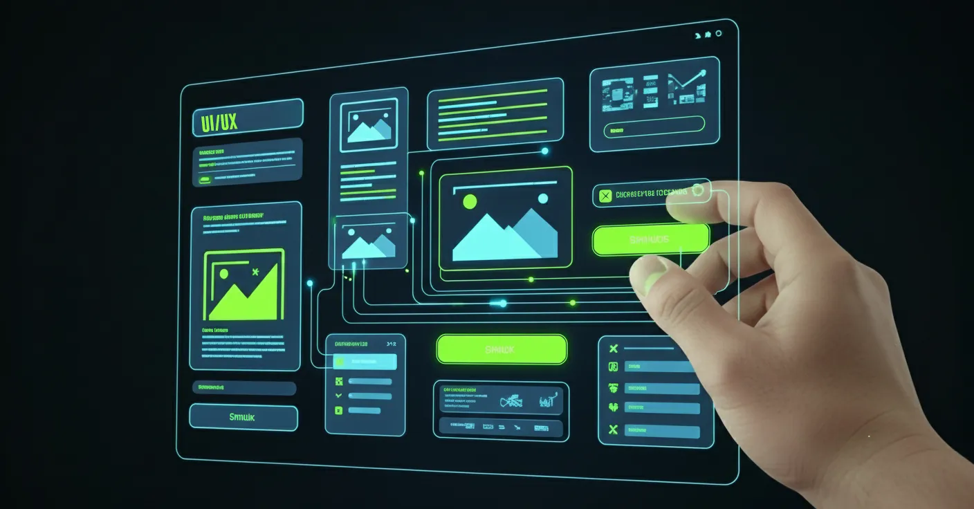
Many see graphic design as simply making a website look good. But strategic graphic design is one of the most powerful tools for shaping your website's User Experience (UX). It’s the silent force that guides your visitors, builds trust, and turns clicks into conversions. At Pixel Hatch Studio, we know that great design isn't just decoration—it's communication.
A visually appealing website that is difficult to use will fail every time. By focusing on core design principles, we create sites that are not only beautiful but also intuitive, fast, and effective. Let’s explore how great graphic design directly enhances your website’s UX, SEO, and bottom line.
Key Takeaways
- Visual Hierarchy: Guides user attention to your most important messages and calls-to-action.
- Mobile-First Design: Ensures a flawless experience for the majority of your visitors.
- Intuitive Navigation: Reduces frustration and helps users find what they need quickly.
- Performance Optimization: Optimized graphics lead to faster load times, better SEO, and lower bounce rates.
1. Mastering Visual Hierarchy for Better Engagement
Visual hierarchy is the art of arranging elements to communicate their order of importance. A clear hierarchy tells the user what to read first, what to look at next, and what action to take. Without it, a webpage is a confusing mess of information that causes users to leave.
- Size and Scale: Important elements like headlines and calls-to-action are made larger to grab attention.
- Color and Contrast: A bright, contrasting color for a "Buy Now" button makes it stand out from the rest of the page.
- White Space: Ample spacing around elements reduces clutter and improves focus and readability.
“Good design is like a refrigerator—when it works, no one notices, but when it doesn’t, it sure stinks.”
2. Mobile-First Design: A Non-Negotiable for Modern UX
With over 60% of all web traffic coming from mobile devices, designing for mobile first is no longer optional. This approach involves designing the mobile experience first and then adapting it for larger screens. This forces a focus on what's most important and ensures a clean, fast experience for every user.
- Simplified Navigation: Menus are streamlined for smaller screens and easier tapping.
- Touch-Friendly Targets: Buttons and links are made large enough to be easily tapped without accidental clicks.
- Optimized Readability: Font sizes and line spacing are chosen for easy reading on a small screen.
3. Intuitive Navigation and Visual Cues
Great graphic design makes navigation feel effortless. Users should never have to think about where to go next. By using clear visual cues, we can guide them through the site seamlessly. A frustrated user is a lost customer.
- Consistent Iconography: Using clear and universally understood icons (e.g., a magnifying glass for search) helps users navigate instantly.
- Clear Button States: Buttons should visually change when hovered over or clicked, providing immediate feedback that the site is responding.
- Logical Layout: Grouping related items together and using visual dividers like lines or cards helps organize content into digestible sections.
4. Performance Optimization Through Smart Design
A beautiful website is useless if it takes too long to load. Strategic graphic design is also about performance. Every image, icon, and font is an asset that needs to be loaded, and optimizing them is crucial for speed, which is a major factor for both UX and SEO.
- Image Compression: We use modern formats like WebP and compress images to reduce file size without a noticeable loss in quality.
- Using SVGs: For logos and icons, Scalable Vector Graphics (SVGs) are used. They are infinitely scalable and have tiny file sizes.
- Limiting Font Files: Using too many different fonts can slow down a site. We choose a limited, effective font palette for brand consistency and speed.
