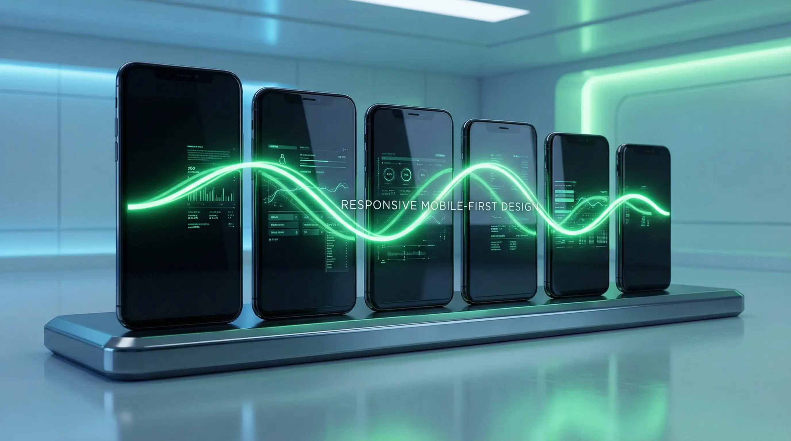
For years, "mobile-first" has been a mantra in web development. We’ve diligently used responsive design to ensure our websites look good on any screen. But in 2026, with the rise of AI-powered features and conversational interfaces, mobile-first is no longer just about responsive layouts. It’s about a fundamental shift in how we architect digital experiences for the device that is always with us: our smartphone.
- Sub-Second Mobile LCP: Loads critical viewport content in under 1.2 seconds on 4G/5G mobile networks.
- Zero Cumulative Layout Shift (CLS): Prevents frustrating layout jumps during dynamic asset loading.
- Touch-Engineered Navigation: Places primary actions and menus within comfortable one-handed thumb reach.
As we at Pixel Hatch Studio design the next generation of websites, we’re not just shrinking desktop designs; we’re reimagining them from the ground up for the mobile context. The smartphone is the primary gateway to the internet for the majority of users, and it’s where the most innovative AI-driven interactions are happening. If your website isn’t built for this reality, you’re not just behind the times—you’re becoming irrelevant.
More Than a Small Screen: The Mobile Context
Mobile-first development in the AI era means designing for a specific set of user behaviors and technical constraints. It’s not just about screen size; it’s about:
- On-the-Go Usage: Mobile users are often distracted, multitasking, and looking for quick, immediate answers.
- Touch-Based Interaction: Interfaces must be designed for thumbs, with large, easy-to-tap targets.
- Variable Connectivity: Mobile networks can be unreliable. Websites must be lightweight and perform well even on slow connections.
- AI as a Companion: As predicted by industry experts, mobile AI is becoming an indispensable shopping companion and personal assistant, used for everything from product discovery to customer support [1].
Architecting for Mobile-First in 2026
Building a truly mobile-first website requires a disciplined approach that prioritizes speed, simplicity, and a seamless user experience. Here are the core principles guiding modern mobile development.
1. Performance is Paramount
On mobile, every kilobyte counts. A bloated, slow-loading site will be abandoned in seconds. The solution is a ruthless focus on performance optimization.
Core Web Vitals Benchmarks in the Mobile AI Era
Performance Benchmarks| Core Web Vital Metric | Good / Elite Threshold | Poor / Penalty Threshold | Mobile Impact on SEO |
|---|---|---|---|
| Largest Contentful Paint (LCP) | Under 2.0 seconds (Elite: <1.2s) | Over 4.0 seconds | Primary Ranking Factor |
| Interaction to Next Paint (INP) | Under 200 milliseconds | Over 500 milliseconds | Smooth Touch Response |
| Cumulative Layout Shift (CLS) | Under 0.05 (Elite: 0.00) | Over 0.25 | Zero Layout Jumps |
2. Embrace Atomic Design
Atomic design is a methodology for creating design systems. It involves breaking down interfaces into their smallest components (atoms), which are then combined to create larger components (molecules, organisms), and ultimately, full pages. This approach is perfect for mobile-first development, as it forces you to think in terms of modular, reusable components that can be easily adapted to any screen size.
3. Design for the Thumb Zone
The "thumb zone" is the area of the screen that is most comfortable to reach with one-handed use. Placing key navigation elements and calls-to-action within this zone can dramatically improve the usability of your mobile site.
4. Integrate Conversational UI Natively
On mobile, typing can be cumbersome. This makes it the perfect environment for conversational UI. Instead of forcing users to fill out complex forms, allow them to interact with your site through voice or text-based chat. This is particularly powerful for tasks like search, product filtering, and customer support.
The Mobile-First Imperative
In the AI era, your mobile website is not a smaller version of your desktop site; it is your primary platform for customer interaction. It’s where your brand will build relationships, drive conversions, and deliver the intelligent, personalized experiences that modern consumers expect.
By embracing a true mobile-first methodology—one that prioritizes performance, modular design, and native AI integration—you can create a pocket-sized powerhouse that not only meets the demands of today’s users but is also ready for the innovations of tomorrow.
References
[1] Digital Marketing Institute. (2026, January 19). The Most Important Digital Marketing Trends You Need to Know in 2026. Retrieved from https://digitalmarketinginstitute.com/blog/digital-marketing-trends-2026
[2] LogRocket. (2025, December 30). The 8 trends that will define web development in 2026. Retrieved from https://blog.logrocket.com/8-trends-web-dev-2026/
References
- Digital Marketing Institute. (2026, January 19). *The Most Important Digital Marketing Trends You Need to Know in 2026*. Retrieved from https://digitalmarketinginstitute.com/blog/digital-marketing-trends-2026
- LogRocket. (2025, December 30). *The 8 trends that will define web development in 2026*. Retrieved from https://blog.logrocket.com/8-trends-web-dev-2026/