Color is more than just a visual element; it's a powerful communication tool that influences emotions, perceptions, and purchasing decisions. In branding, color psychology is the strategic use of color to connect with your audience on a deep, subconscious level. It's the silent language that tells your brand's story before a single word is read.
At Pixel Hatch, our branding process is rooted in this science. A strategic color palette is not just about looking good—it's about building a brand that feels right. Let's explore how specific colors can shape your brand identity and influence consumer behavior.
Key Takeaways
- Emotional Connection: Colors evoke specific, predictable emotions. Blue builds trust, while yellow inspires optimism.
- Brand Recognition: A consistent color palette makes a brand instantly recognizable in a crowded market.
- Cultural Context Matters: The meaning of a color can change dramatically across different cultures and demographics.
- Strategic Application: The goal is to choose colors that align with your brand's personality, target audience, and industry.
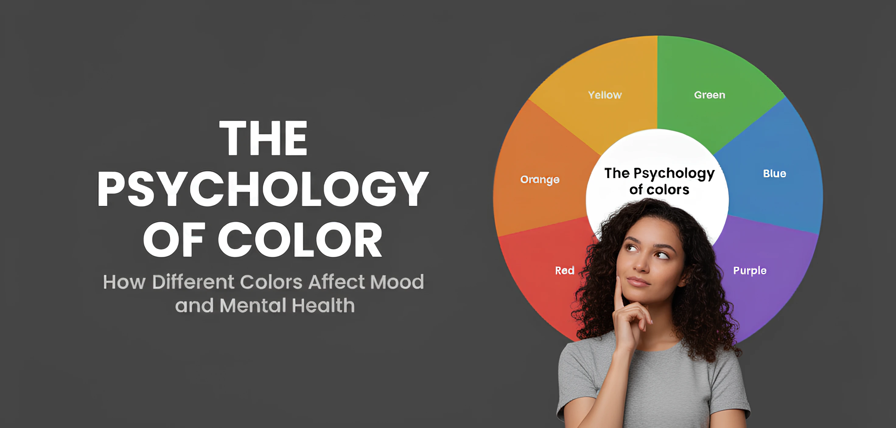
Understanding the Emotional Spectrum of Colors
Choosing a brand color is about choosing an emotion. Here’s a breakdown of what some of the most common colors communicate in a Western context:
- Red: Evokes energy, passion, and urgency. It's often used by food brands (McDonald's, Coca-Cola) to stimulate appetite and by retail for clearance sales to create a sense of immediacy.
- Blue: Conveys trust, security, and professionalism. This is why it's the dominant color for banks (Chase), tech companies (Intel, IBM), and social media platforms (Facebook, LinkedIn).
- Green: Associated with nature, health, wealth, and tranquility. It's the go-to for organic brands (Whole Foods), financial services, and environmental causes.
- Yellow: Represents optimism, youthfulness, and clarity. It's used to grab attention and create a feeling of happiness (IKEA, Snapchat).
- Black: Signifies luxury, sophistication, and power. It's a staple for high-end fashion and technology brands (Chanel, Apple) to create a premium feel.
"Color is a power which directly influences the soul."
How Color Builds Instant Brand Recognition
Consistency is the key to making a color your own. When a brand uses its color palette consistently across every touchpoint—website, logo, social media, packaging—it builds a powerful mental shortcut in the consumer's mind. Think of Coca-Cola's iconic red, Tiffany & Co.'s robin's egg blue, or Cadbury's distinctive purple. These brands have used color so effectively that they "own" it. This instant recognition builds familiarity, which in turn builds trust and loyalty.
A Note on Cultural Differences
It's crucial to remember that color perception is not universal. While white symbolizes purity and weddings in Western cultures, in many Eastern cultures, it's the color of mourning. Similarly, red signifies luck and prosperity in China, but it can represent danger in other parts of the world. A successful global brand must consider these cultural nuances to ensure its message is received as intended across different markets.